
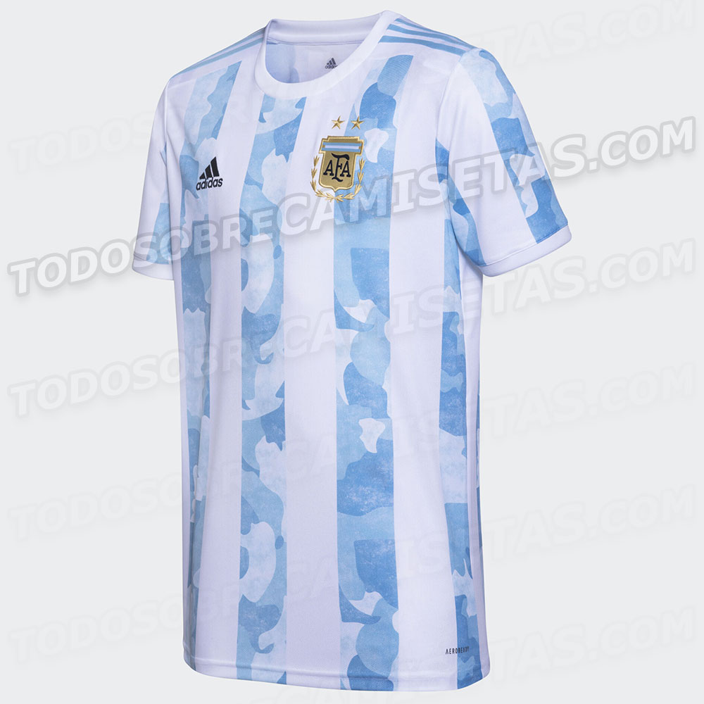
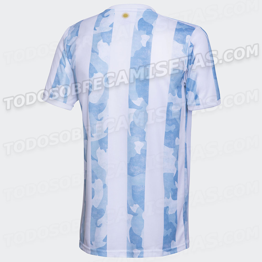
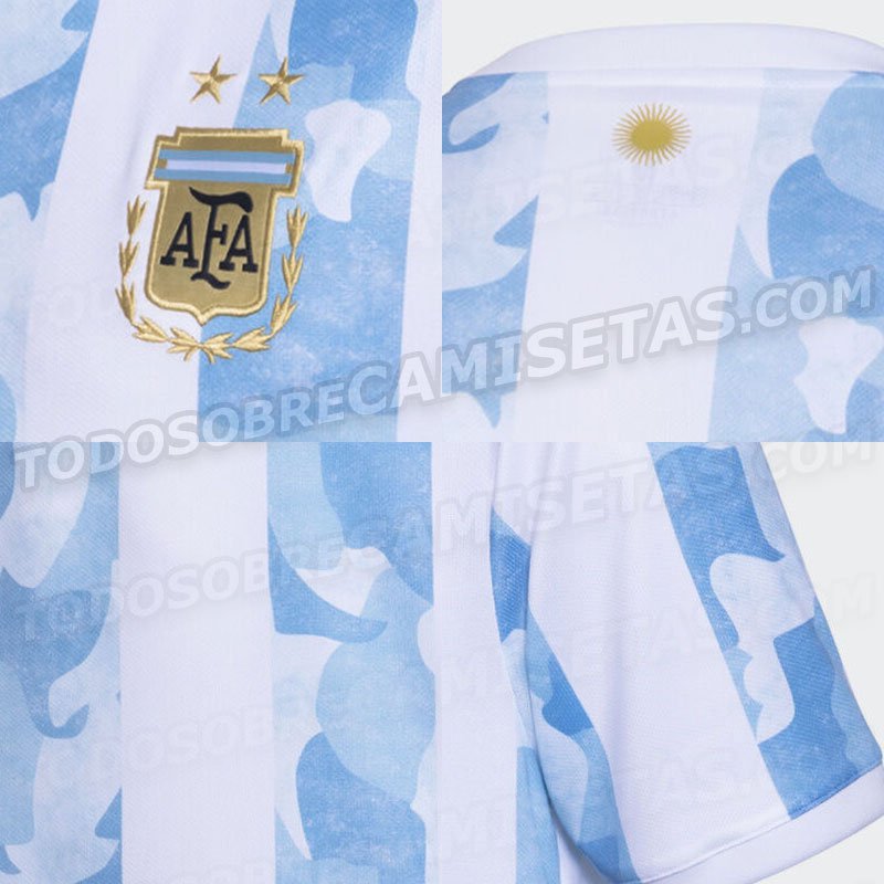
Pictures have leaked of the new Argentina home shirt.
The new shirt was expected to be used for this month’s World Cup qualifiers as well as the Copa America. However, both have now been postponed. Pictures have been released by Todo Sobre Camisetas showing the new Argentina home shirt.
There will not be a new away kit as the away one was released back in November.


 (1)")

I thought it was fugly at first but it’s grown on me a bit. Maybe it will look better in person. Like Vikin said, the little sun is nice touch.
i do agree with the sentiment that traditional is always better. Away kits are better to play with colors and design.
Certainly an interesting approach for the home shirt. I don’t like camo pattern for clothes in general but I quite like this one to be honest. I like the sun they’ve added to the neck. Our current shirt is a bit too light for me and during games it almost looks all white. We’ll see how this looks from distance. Plus our players will be more difficult to spot for the opponents because of the camo 😉
Horrific design. No need at all to mess with the classic vertical blue and white stripes. As for going horizontal ? That is the Pumas classic shirt. The idiots at Nike tried to mess with that classic shirt as well before quickly reverting back to the old one. Both the Albiceleste and Pumas shirts are classic designs that do not need to be messed with.
Drug Rehab Centers Drug Rehab Centers Near Me Drug Rehab Centers Near Me Alcohol Rehab Near Me Alcohol Rehab Centers
Unfortunately merchandising revenues are important for national football associations. They need to generate revenue and come up with new designs for every tournament. Agree with other posters that we should stick to the classic albiceleste shirt and only change the end of the sleeves (black or white) and shorts. Experimenting with the away shirt is fine.
It’s too boring to lead a life without football
They r finding ridiculous combinations to destroy 2 beautiful colors. What’s with those patches inside. It’s bad. It looks better on the away jersey but it looks bad here.
Instead of doing this much why can’t they try a horizontal patters instead of the vertical. Just for a change. It’s been long time we r following the vertical pattern.
N/T always have a creative team to create a new jersey fashion and style. Trust that Scaloni and his gang did not handle and works on it.
It’s Hideous!!!
Sorry, the Albiceleste jersey should ALWAYS ALWAYS ALWAYS stick to the traditional style.
I hate when they change our jersey, if you want something different change the away jersey all you want instead. Knock yourselves out.
This is complete trash.
agreed !!
Yup, seems like it….and I kinda like it!
Snow Camo??